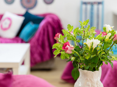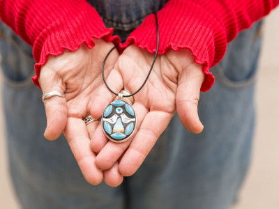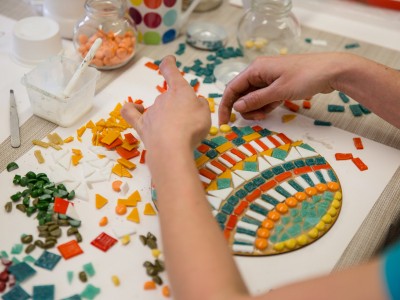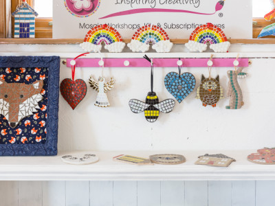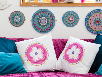
I’ve had three logos over the years and they’ve all been flowers. I’ve had a black and white one, a pink collaged one, plus my shiny, new graphically designed one, created earlier this year.
It was only until recently, when I saw a news clip, during the election, that it finally dawned on me….. my logo was inspired by the opening titles of The Good Life.
I loved watching it as a child, with all the comedy shenanigans between neighbours, the Goods and the Leadbetters, and I’m convinced it has gone on to have a subliminal influence on my current logo design. (Not to mention my Dad was just like the main character Tom Good, played by the late Richard Briers, with his ‘Sloppy Joe’ jumpers, large vegetable patch and the goats and chickens!)
So there we have it. A new revelation. The branding for Rachel Shilston – Inspiring Creativity, was inspired by a popular 70s TV programme.
For more information on where my inspiration comes from, check out my other work at www.rachelshilston.co.uk/commissions

